
Visual identity for Geysa Alves, architecture and interiors
- Year
- 2021
- Role
- Branding, Logo design, Stationery
- Category
- Graphic Design
- Tools
- Illustrator, Hand sketches
Context
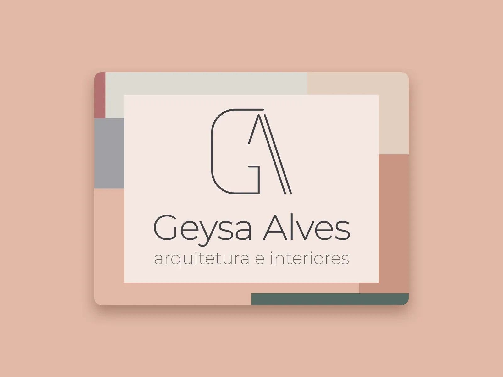
Geysa Alves is an architect who needed a brand to present her architecture and interior design work with sobriety and warmth.
I created the full identity in 2021, from the first sketch on a whiteboard to the short guide of colors and fonts and the application mockups.
Challenge
Create a simple, recognizable mark that works at very different sizes and on very different materials, from a business card to an engraved bottle.
Convey architecture and warmth at the same time, with few elements and a fine line.
Solution & design decisions
- 01
Exploring many paths on the whiteboard
The sketches test roofs, houses, pyramids and diamonds, along with G letters with arrows and arcs. This repertoire of architecture-related shapes was the starting point of the final brand.
- 02
A fine-line GA monogram
The G and the A share the same drawing. The stroke of the A recalls a sloped roof, in a double line, and the rounded G adds warmth. The result is a clean symbol that works in line only.
- 03
An earthy six-color palette
Graphite, wine, moss green, gold, light pink and light gray. Each color has a monogram version that stays legible, light line on dark backgrounds and dark line on light ones.
- 04
Two typefaces
Montserrat, with geometric forms, for the name and the descriptor. ISOCP3, with a technical look that recalls project drawings.
Deliverables
- Main logo with monogram, name and descriptor
- Standalone monogram in square versions, for social media
- Six-color palette and typography guide
- Application mockups on a business card, tote bag, bottle, folders, planner and desk pad
Outcome
Complete identity delivered in 2021, with the brand files and a short guide of colors and fonts for stationery, gifts and social media.
Gallery
Image transcripts
Color palette and typography
Summary board of the Geysa Alves, architecture and interiors visual identity. The original board is in Portuguese.
Color palette:
- Graphite: #434347
- Wine: #714441
- Moss green: #576A63
- Gold: #DCB67F
- Light pink: #E0B8A6
- Light gray: #DDD9D2
Fonts used: Montserrat and ISOCP3, with upper and lowercase letter samples of each.
Want a result like this for your project?
Tell me what you need and get a quick reply.
More projects
Apps
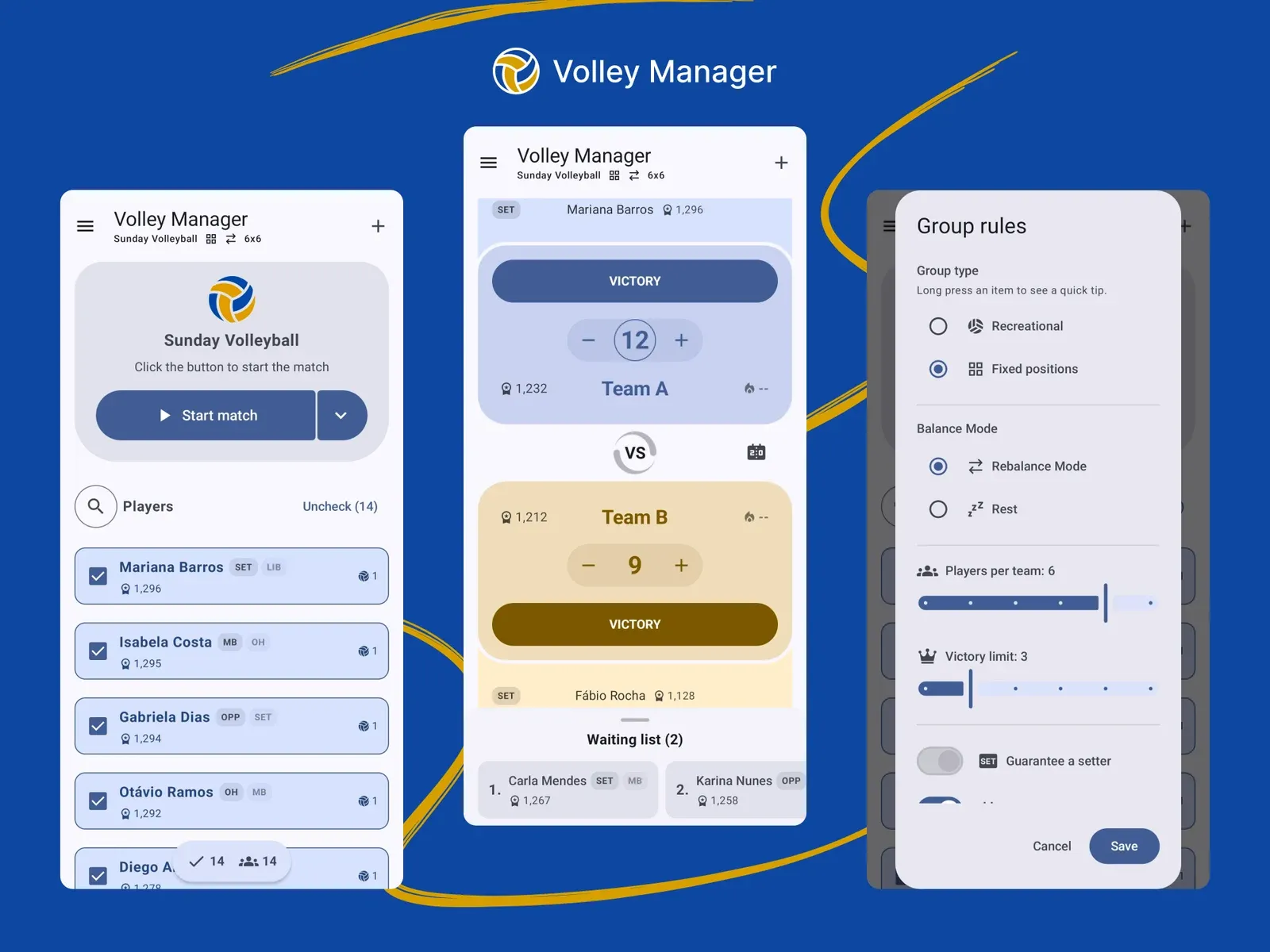
Volley Manager — an app to run friendly volleyball games
An Android app that builds balanced teams with Elo, manages the waiting queue and takes the "who plays next" argument off the court.
Read case study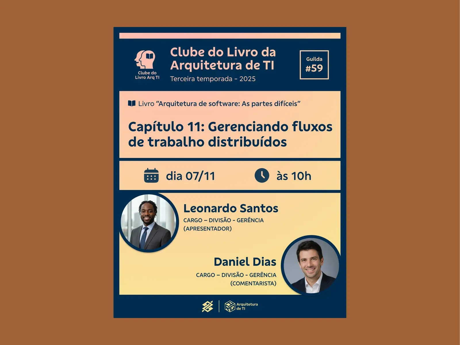
Graphic Design
Visual identity for the IT Architecture Book Club
A refreshed identity for a corporate book club, with clearer hierarchy and a gradient system that changes with every meeting.
Read case study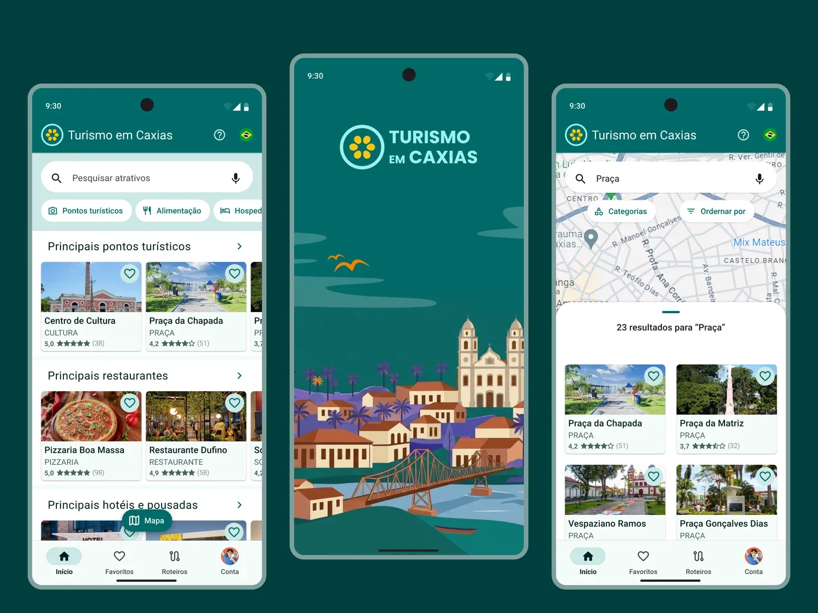
Apps
Turismo em Caxias — mobile app prototype
From audience research to the final prototype, an app that brings a city's attractions, favorites and itineraries together in one place.
Read case study